Songme is Your Show, Everytime.
In 2019 I was lucky to join an amazing group of spirited entrepreneurs wanting to create an app that would revolutionize the way we listen to live music. Through the Songme App, audience members can request songs from the musicians with a custom tip. It digitizes the old fashion act of going up to a performer or dj and slipping them a $10 to play Drake, or whatever it is the kids are listening to.
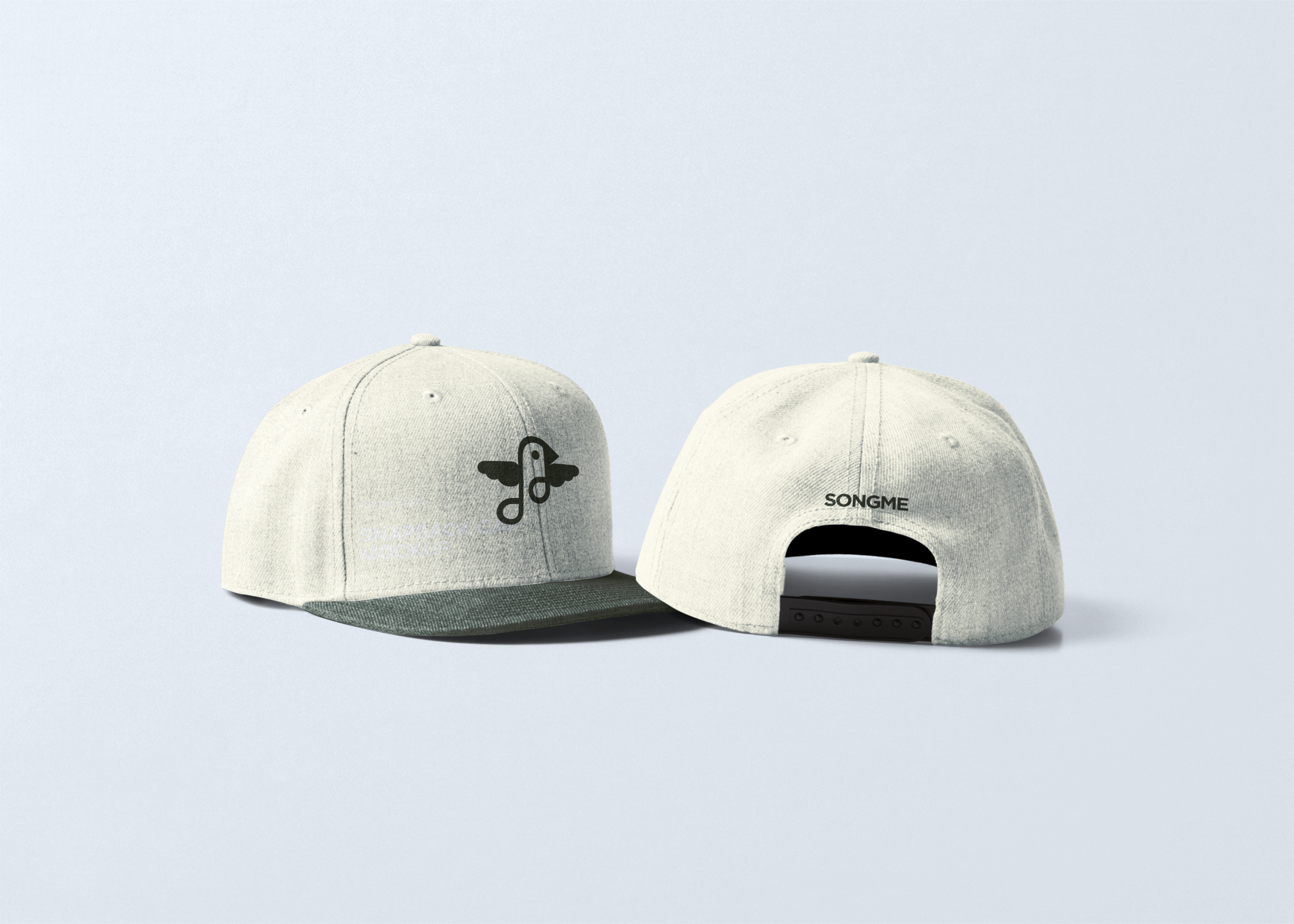
My role was to create their logo. I considered the purpose of the app-connecting people and creating intimate and interactive musical events. I also considered the canary bird since it sings and flies, just like the Songme musicians who spread their wings, taking their talent to the stage and being in control of their earnings. I wanted the logo to represent the friendly and welcoming community Songme has thus far built. So, what came of all this brainstorming was something that resembled a music note bird. Genius!
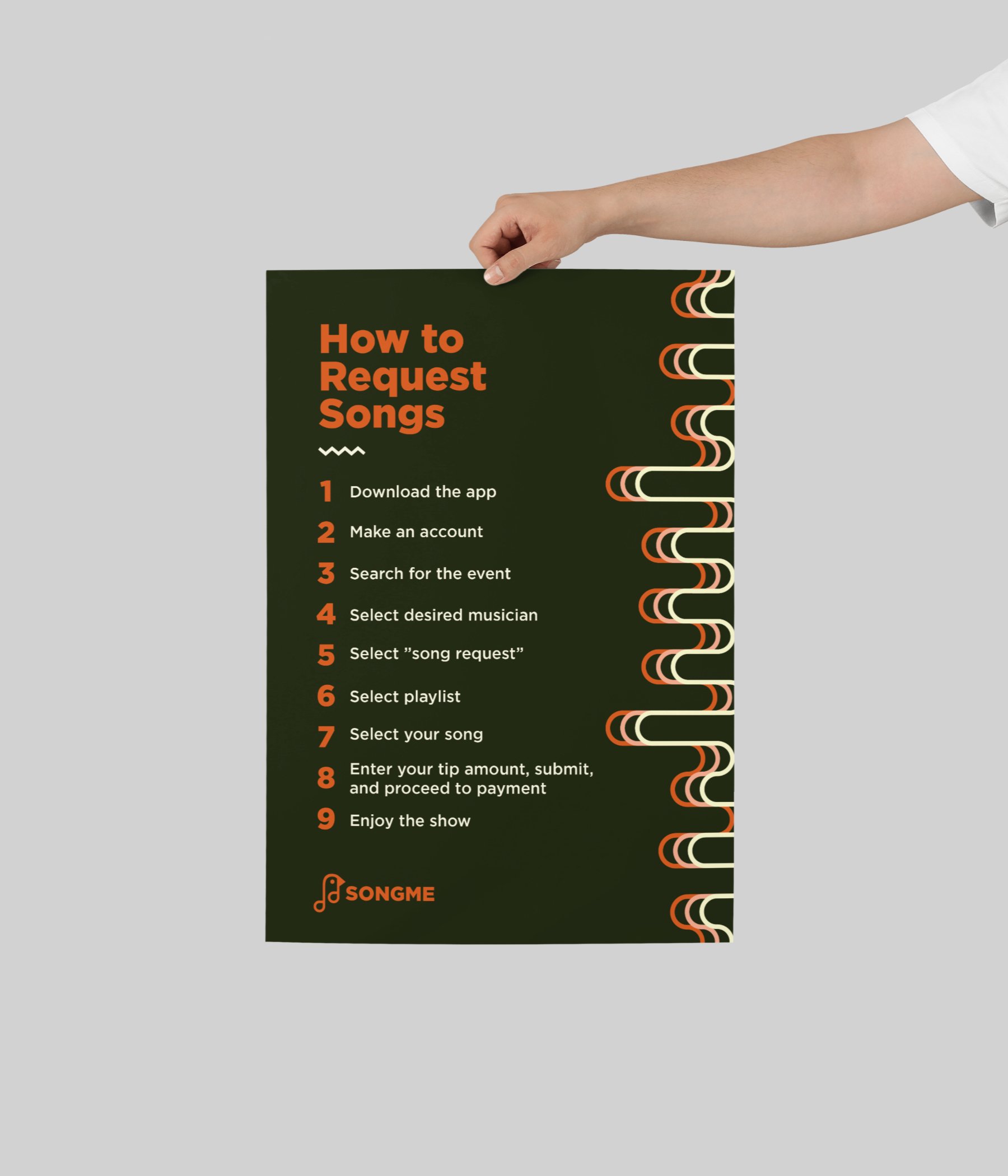
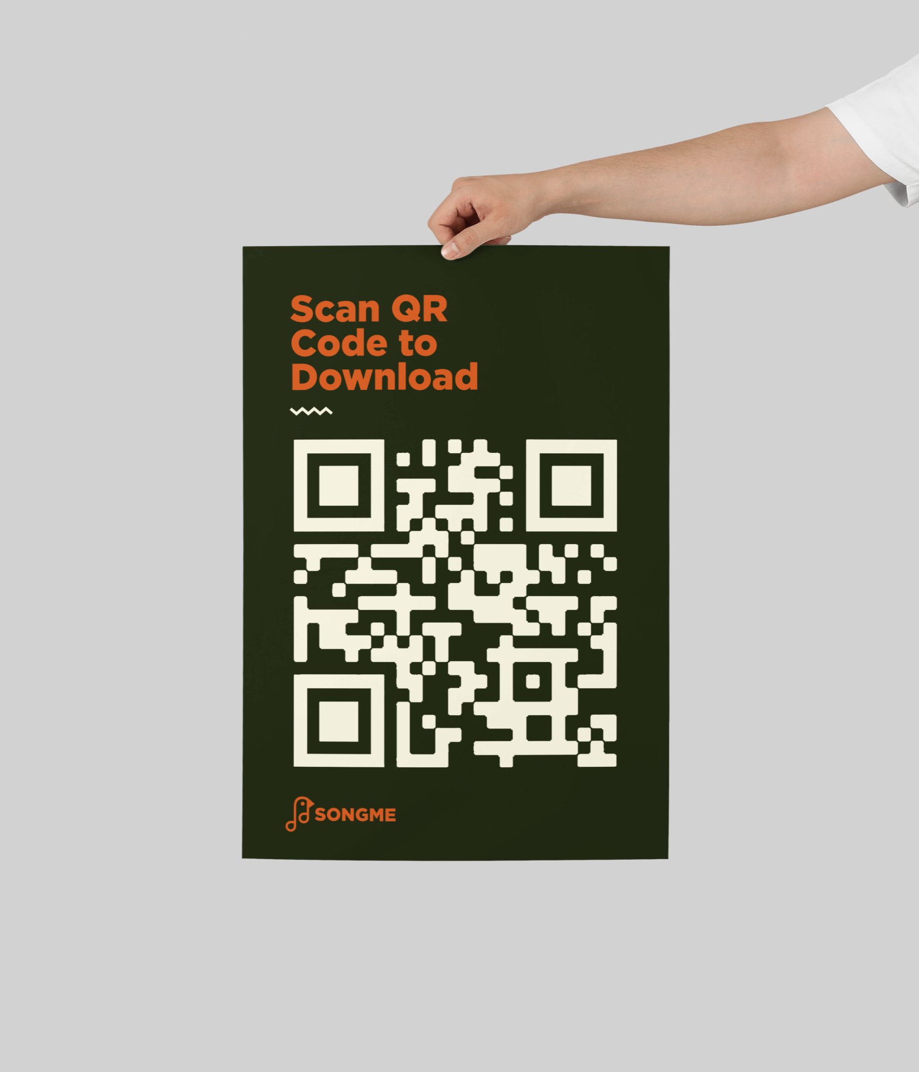
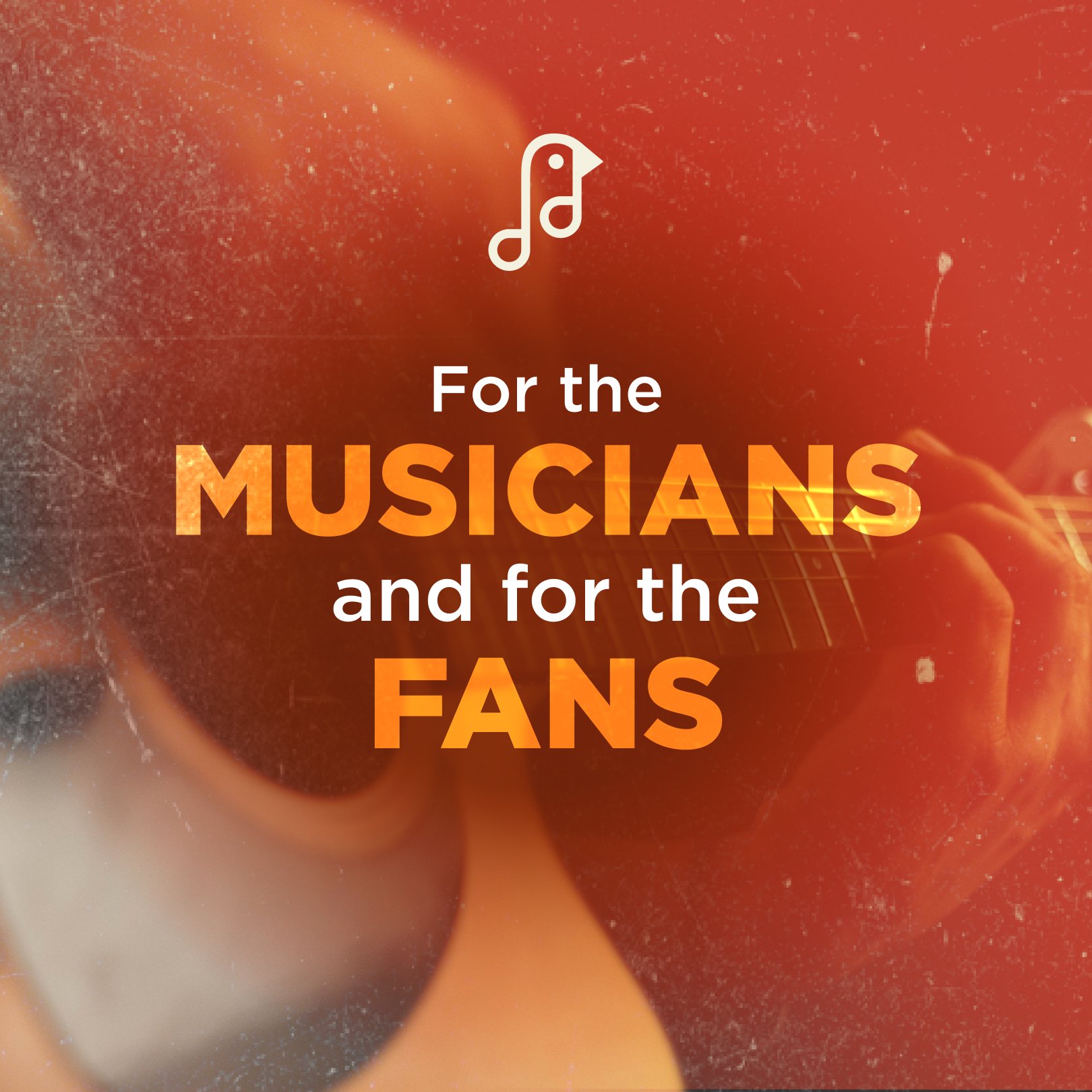
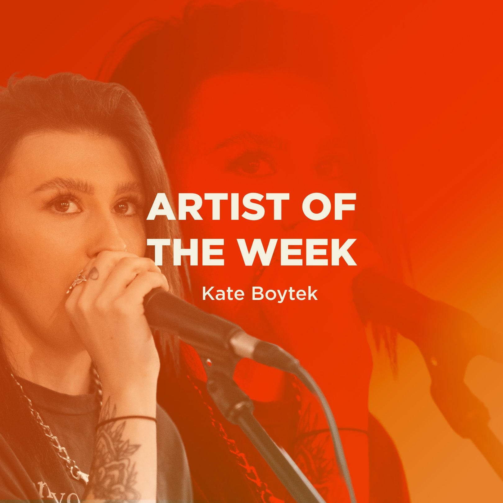
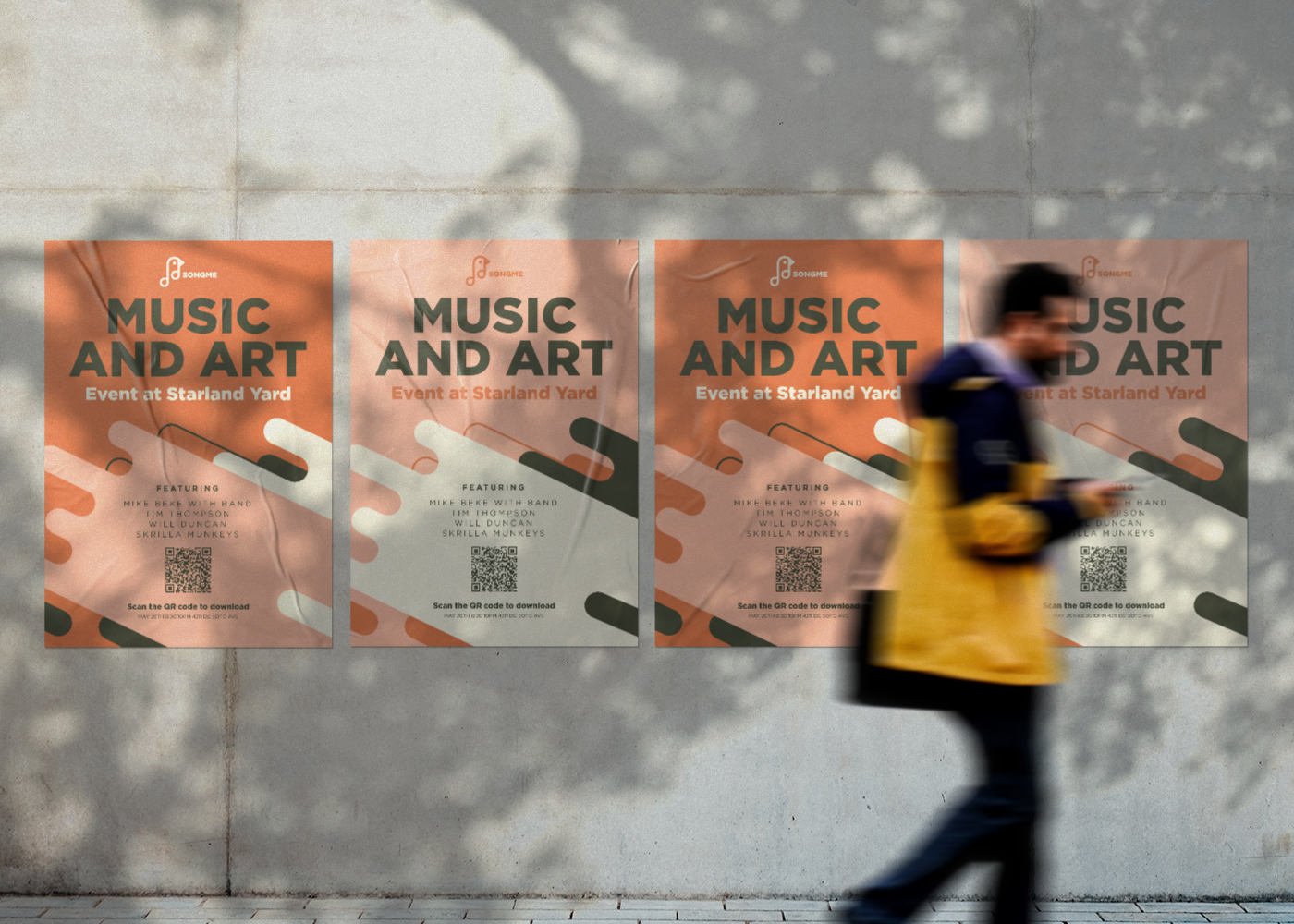
Since then, I’ve been their sole graphic designer, doing everything from flyers for shows, banners, how-to-infographics, social posts, and merchandise.

How It Started…
When it came down to designing the Songme logo, a few things were considered.
It had to resemble the popular songbird; the canary
It had to resemble a music note
It had to be inventive, distinctive and minimalist
I went through a ton of thumbnail sketches before I arrived at the final solution used today
The main type choices consisted of Qualy, a sans serif display font that we used in the logotype and the Gotham font family. I felt Gotham has the perfect balance of boldness and simplicity without being too modern or unique. The letter width and height is perfectly proportioned and there’s a good variety of weights to choose from. When considering colors, I felt a palette that had a a subtle retro feel would be effective considering our users are small town artists who perform for small to medium local audiences at live venues. There is something old fashioned about this kind of a concert which is why choosing colors that aren’t overly bold and bright was important.
