Nacha 50th Anniversary
Faster, Smarter Payments Convention Celebrating 50 Years of ACH Transfers
Here are three themes pitched to NACHA for their 50th anniversary. The winning concept was “Moving Payments Forward”, where I expanded the ad like objects across potential print ads, social ads, banner ads, and a webpage ad and then created a style guide.
The Manifesto for Moving Payments Forward reads:
The ACH network is more than simple convenience. It is a revolution. Nacha made this possible by iterating and re-iterating, building innovations upon innovations that directly connects people and businesses with their labor. By moving the science of money forward, Nacha is moving commerce forward. They’re moving opportunities forward. They’re moving payments forward.
-Joon Kim, Copywriter at Avoq
Concept 1 (winner) : Moving Payments Forward


Concept 2: Transformative Transfers


Nacha SFP 2025 Campaign
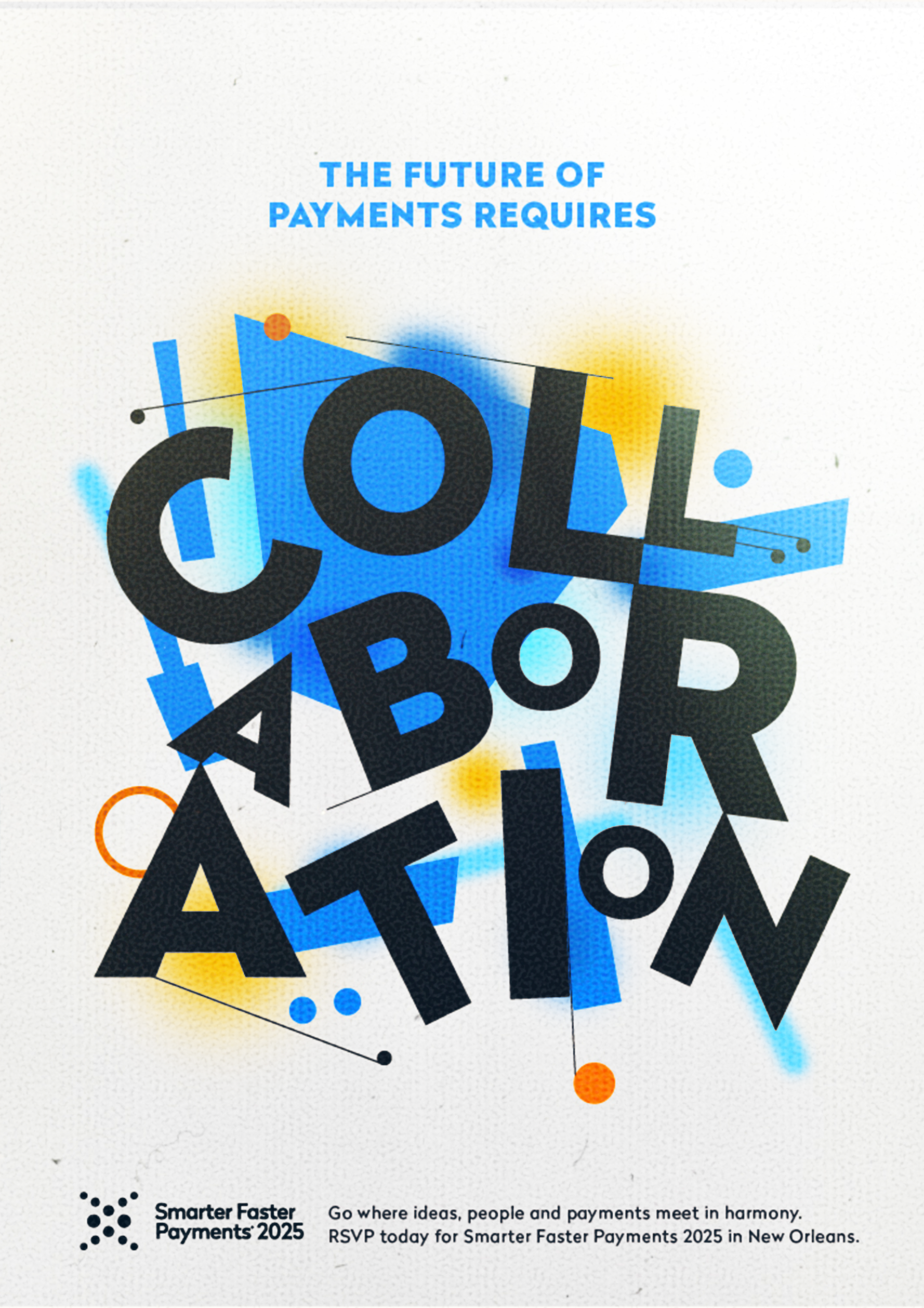
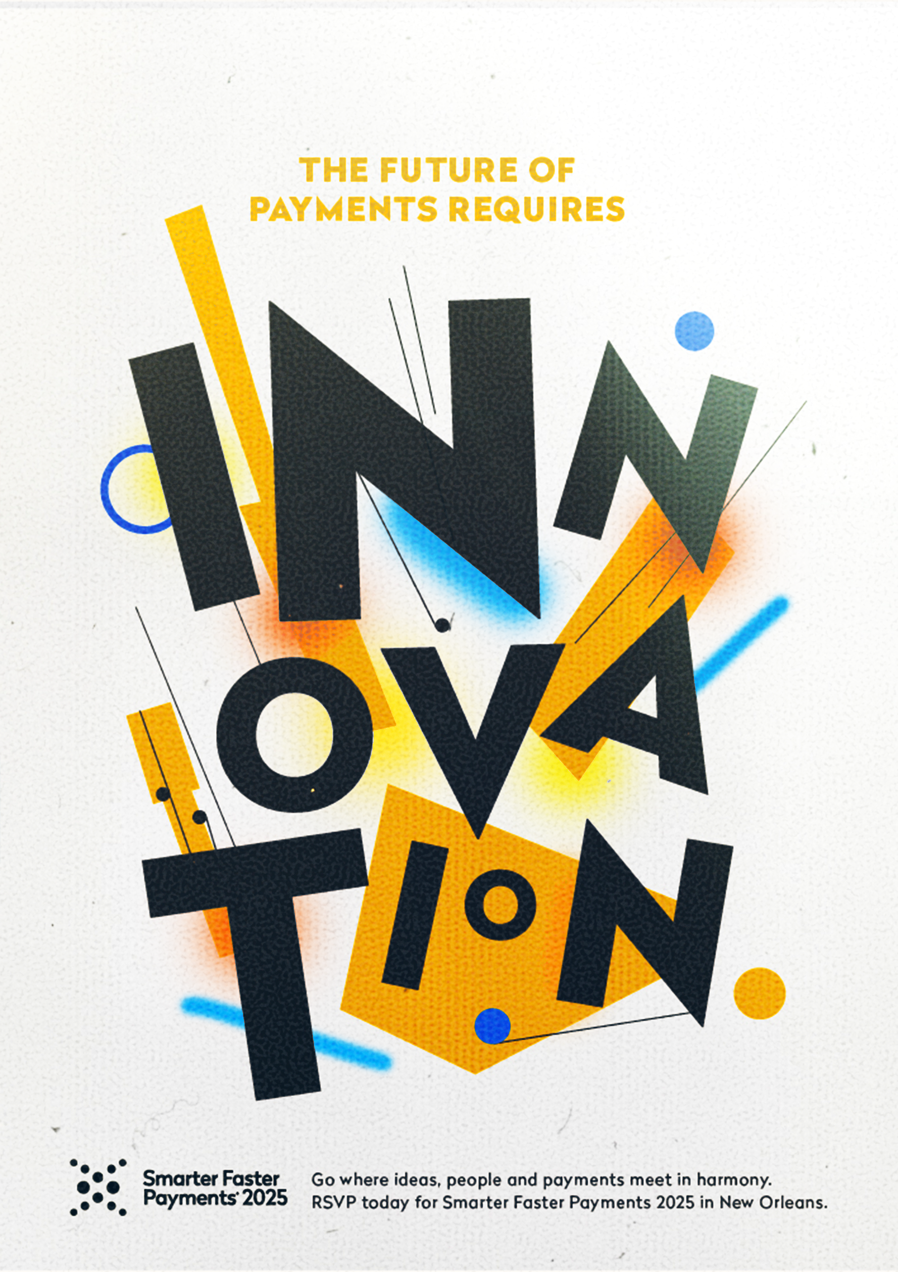
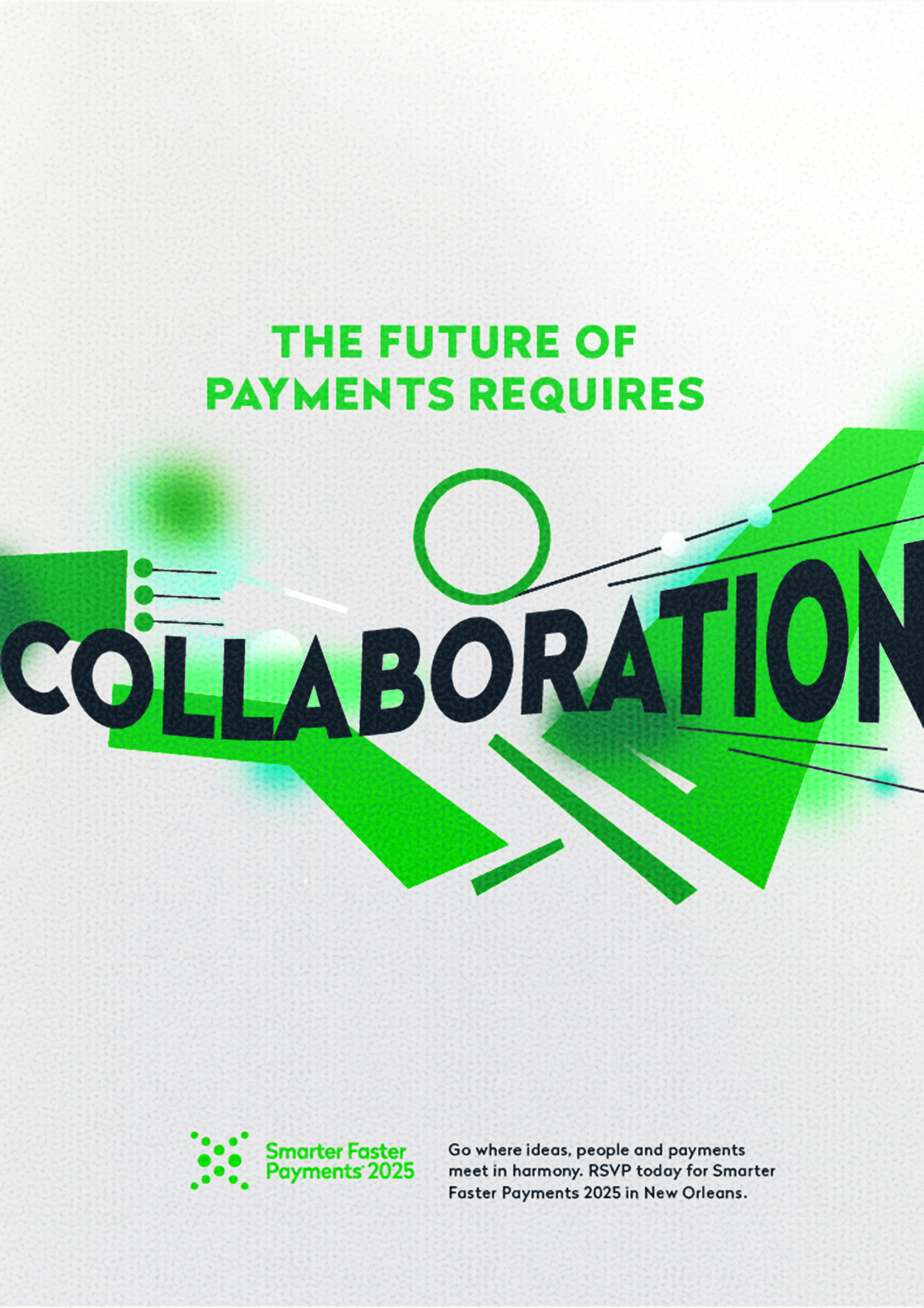
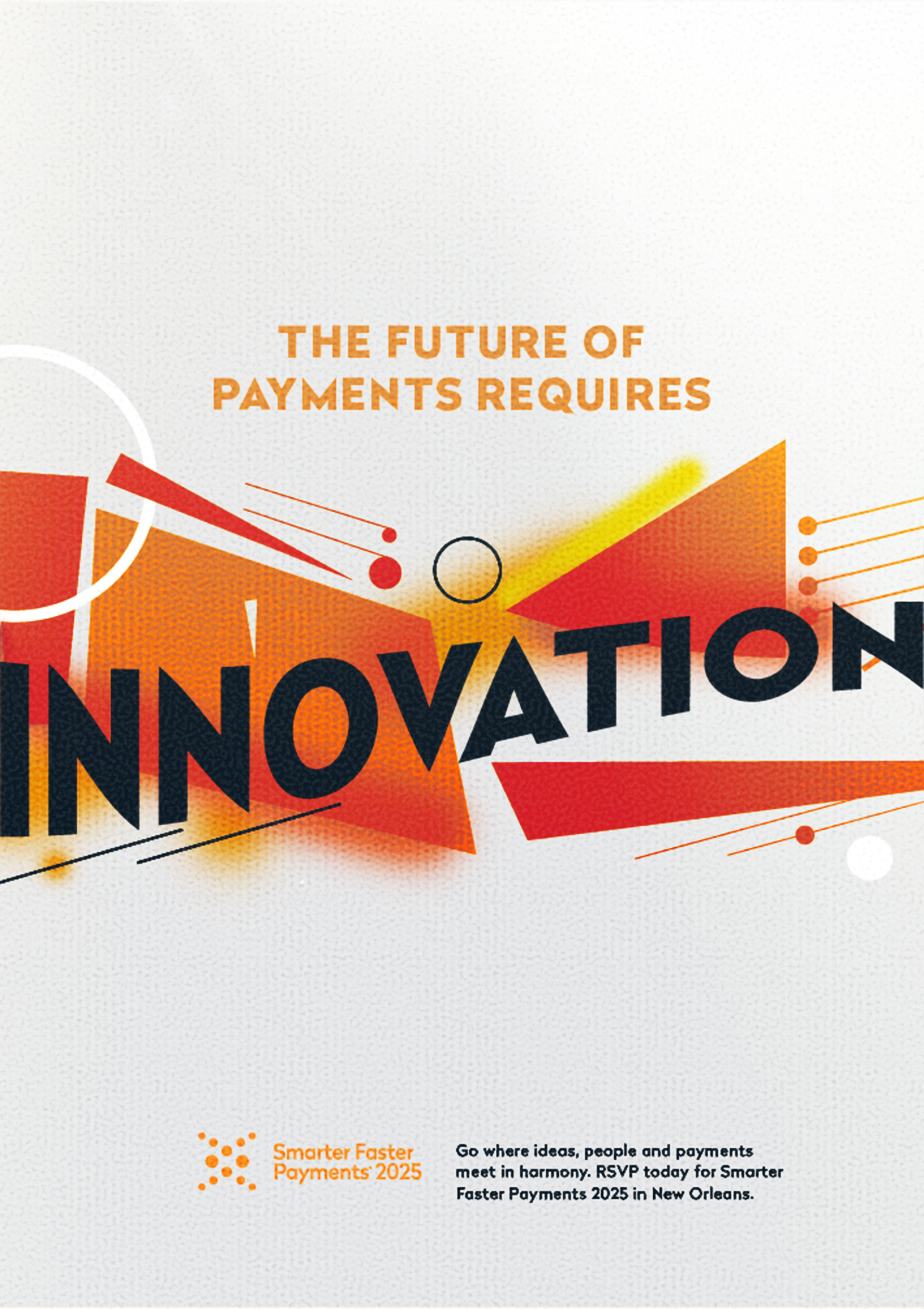
The 2025 convention is hosted in New Orleans, LA. Themes of Jazz are a driving force behind the first concept and the city’s historic architecture lead the second.
Concept 1: Ode to jazz
When innovation, collaboration, and security come together, something magical happens. It sounds like progress. Strength. The future. It’s subtle, but the melody is there, in the unexpected partnerships that propel us forward. Where technology meets human-first principles. Where guidelines transform into maps for tomorrow. Where the ways that money moves strike a chord with sound security. The tempo picks up. The band surges. This is faster, smarter, safer payments in harmony. This is payments.
Taking inspiration from the location of this year's conference, the dynamism and energetic nature of jazz inspired this first execution. Elements of the music genre are subtly referenced by way of composition, scale, and abstraction of shape. Music notes are used interchangeably with the recognizable Nacha dots.
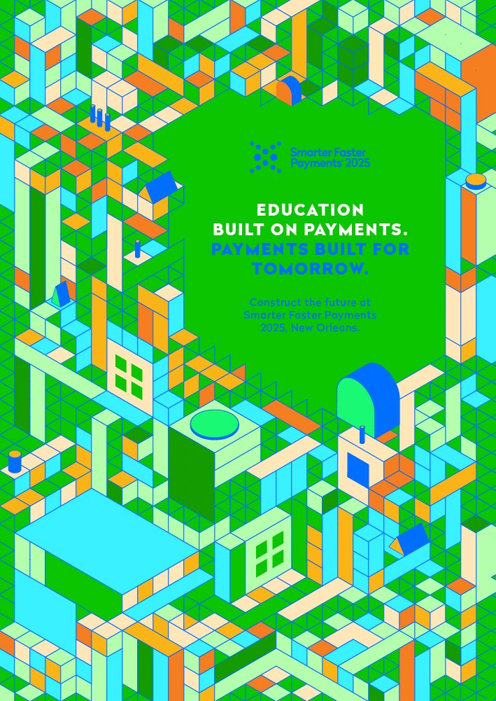
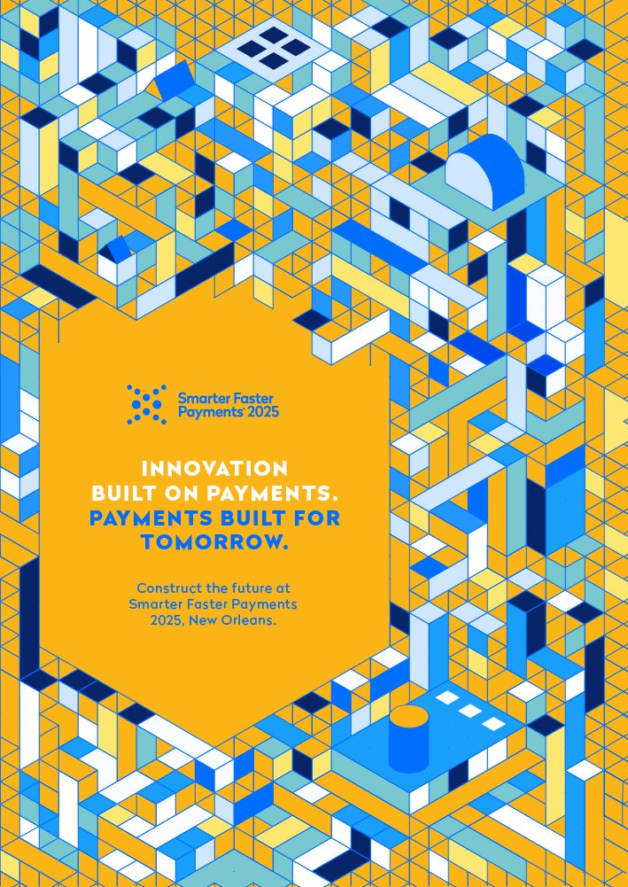
Concept 2 (Variation 1): Building Blocks
Modular, geometric shapes evoke the ideas of the future, frameworks, and constructing something big. The color usage keeps it within brand and helps it pop, while repetition makes the design easily repeatable across various mediums.
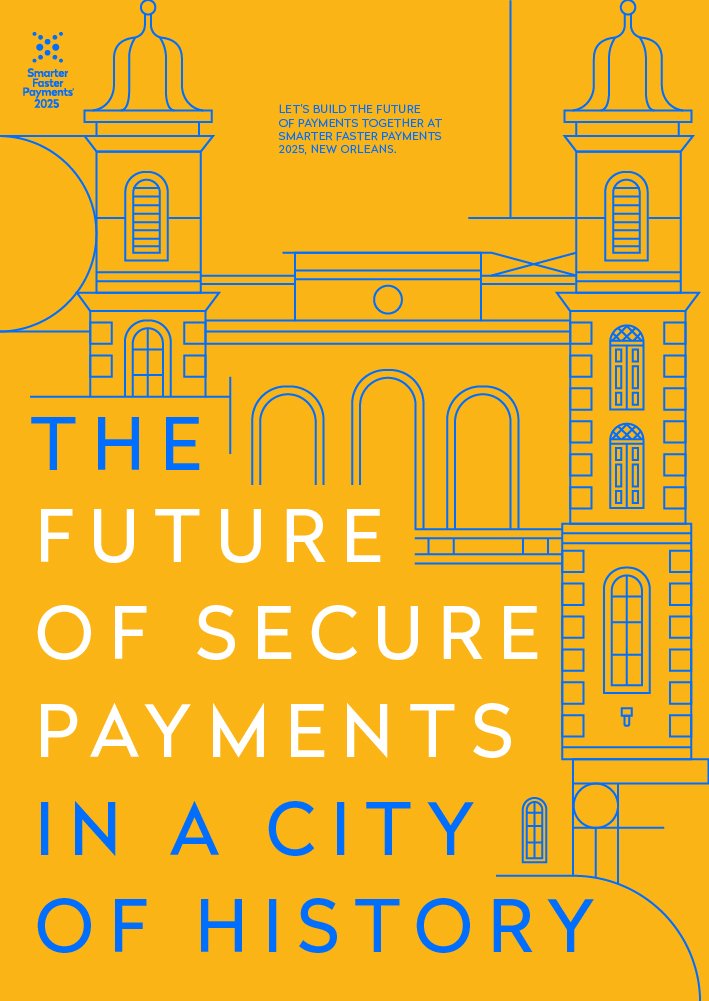
Concept 2 (Variation 2): Past, Present, Future.
Building the future requires clearly understanding the past–an appreciation for what has come before, where we strive to understand the foundations of where we stand. But moving forward also means we cannot rest upon previous laurels. And while we can appreciate the aesthetics and goals of old, real progress is made by integrating what we’ve learned to create something new. Smarter. Faster. Safer. So in this city of history, we’re finding new ways to progress. Where we build secure systems for how people actually move money, instead of relying on what worked before. Let our history together define a better, more secure future for payments. Because wherever payments move, Nacha will be there.
For this execution, we blended old and new. The iconic and historic New Orleans architecture is built into grid-like geometric ornamentation around the headlines. The highly detailed facades of these buildings are given a modern treatment in this linear art style and bold, contemporary typography.
